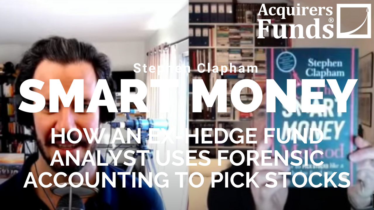
During his recent interview with Tobias, Stephen Clapham, author of The Smart Money Method, discussed Using Simple Charts To Measure Investor Sentiment. Here’s an excerpt from the interview:
Tobias: Well, let’s just go back a little bit to the process, because I’m sort of interested to know it. Once you get the hot tip from your mate at the pub or from your wife, what’s the next step after that? [crosstalk]
Stephen: Well, the big step after that– The thing is, what I used to do is, I used to always have a lot of things on the watchlist. The problem then is, you don’t want to go away and do an in-depth piece of research on an idea that may or may not be a good one. So, my system and the system I recommend in the book is, the first stage is what I call “Testing the hypothesis.” I’m looking at a stock, why am I looking at it? I’ve got some reasons, some hypothesis about it, some reason I think it’s going to go up or in the case of the hedge fund, it’s going to go down. But the case of the retail investor, for some reason you’re attracted to it, and you think that it’s going to go up. The first stage is to test that hypothesis, why do you think it’s going to go up?
Then, what I do as I go through the steps, and I reckon that it would take me between 30 minutes and two and a half hours to do this quick review, and I go through all the steps. Now, some of those steps aren’t feasible for a private investor because if you’re sitting in a big hedge fund, it’s very easy to print off half a dozen research notes. You can do that in five minutes on Bloomberg and you scan them, and that isn’t available to private investor, but there is research available. There is press cuttings, there’s a lot of information on the internet. So, I go through the various steps and one of the steps is looking at the charts. I get a lot of flak because people– fundamental investors say, “Well, how can you look at the charts?” I’m puzzled why people think this. In fact, one of my colleagues, I used to work with say, “I don’t know why you’re wasting your time with the charts.” But it’s not that I’m a great chartist and looking at candlestick patterns and reverse flags or anything like that.
Tobias: The bearish harami.
Stephen: I simply look at the chart as a data representation of market psychology. The share price is the most informative thing about a stock because it tells you what the market thinks of that stock. And it tells you when the market thought the stock was in favor and when the market thought the stock was out of favor. And by using that, you can then translate, why is the market viewed the stock in that way? Because our job isn’t just to figure out what’s the company really worth? Our job is to figure out what’s the company really worth, and why does the market not recognize that? Because you only make money if there’s a gap between perception and reality? And you’ve got to understand well, why is there that gap, and what might happen to close the gap?
Now, obviously, over time, if you’re right in the reality, the market’s perception will turn around, but there may be something fundamental about that stock, that means the market may take a long, long time to change its mind. And those are the stocks that you want to avoid because you might be right, the company might do very well. But if the market hates the management and thinks they’re crooks, until the managements change, people won’t warm to it. So, you’ve got to understand that gap between perception and reality.
I go through some of the basic quick valuation tests that you can do very quickly to decide, is this stock worth pursuing? So, in my case, as a hedge fund doing special situations, so, very deep work on a small number of ideas, this would just be the prelude to actually going and doing very much detailed work, but for a private investor, this might be, “Oh, you do?”
Tobias: So, just to go back to the chart, what are you looking for when you’re looking at the– that’s a nice mug you’ve got there. I like that. Is that your book cover on the mug?
Stephen: Yeah, that’s a book cover in the mug. Yeah, I copied your idea.
Tobias: That’s great. I love it.
Stephen: I saw you had The Acquirer’s Multiple on your mug. So, I thought, “That’s a very clever idea. I’m going to do that.”
Tobias: [chuckles] I love it. What are you looking for on the chat? Are you looking for something that’s fallen? Are you looking for momentum? How are you viewing it?
Stephen: I’m not looking for anything in particular. I’m just looking to see– it’s not that I would buy a stock because it was below or above its moving average or anything like that. I’m simply looking at the chart as a representation of how the market feels about that stock today. I might well buy a stock that’s falling. Remember, I was working at big hedge funds, and we were taking big positions. Once the things turned, you can’t really buy it, you’ve got to buy the falling knife–
Tobias: You need the liquidity.
Stephen: –to make real money. But that’s not the case for every position, every place I’ve been working or every position that I was taking. Often you might take a small position in something that was actually going up because you thought, “Well, now the sentiment’s turning.” The book is basically, I’ve taken the book and it’s the same format and same layout as my online course. In the online course, we go through this how to test hypotheses. I just use the example of Procter & Gamble. It’s obviously a big well-known company, and an easy thing to look at. When I did that, the chart actually had turned around. P&G, then at that point was quite interesting because the share price had gone above where it had been in the last five years. The analysts were still very lukewarm about it. One of the things I say is, look at how many buys and how many cells and how many holds there are, and at the time that I did this, P&G had four buys, 16 holds, and one sell.
Now, sells are very unusual, but that that profile of 16 holds, tells you that the South Side has fallen out of love with the company, but 16 holds is a very, very low rating by US standards. The fact that the shares have turned around in the last six, nine months, and they’ve actually been very strong, told you that the market was changing his mind about P&G. It had been dull, for the last five years. It’s created sideways. And here, people were starting to get interested in again. That piques my interest. If had carried on falling, I would still have been interested in it, because obviously, it would have been cheaper, but it’s just using the chart to tell you about how the market feels. I think that’s very overlooked and very important.
You can find out more about Tobias’ podcast here – The Acquirers Podcast. You can also listen to the podcast on your favorite podcast platforms here:
For all the latest news and podcasts, join our free newsletter here.
Don’t forget to check out our FREE Large Cap 1000 – Stock Screener, here at The Acquirer’s Multiple:


